Brand identity design in Saudi Arabia
A system anyone can apply. Not a picture only you can.
An identity is a system, not a picture. It is what lets a poster in Jeddah, an Arabic invoice, an app screen and a shopfront in Riyadh all read as one company — with a colour range, an Arabic and Latin type pairing, a layout grid and rules clear enough that someone who has never met us can apply them correctly.
Matched for weight and x-height, so a bilingual line sits level.
One grid that mirrors cleanly, so RTL is a setting — not a redesign.
A logo is one asset. An identity is the rules around it. Only one of the two survives contact with a new designer.
What a brand identity system includes
The identity is everything that makes your material recognisable before anyone reads the name: a colour range with defined roles rather than a swatch, a typographic scale for headlines, body and interface text, a layout grid, an approach to photography and illustration, iconography, and the rules that tie them together. The logo is one component inside it — an important one, and the subject of its own page.
The test of a system is the awkward case, not the poster. Does the palette still work when it is a two-colour print job? Does the headline face have an Arabic companion with a matching weight range, or does the Arabic quietly fall back to a system font on every device? Does the layout survive a right-to-left flip, or do the alignments and the logo end up on the wrong side? We design against those cases from the start, because they are where identities actually break.
Bilingual typography is the part that most often goes wrong here. Arabic and Latin faces are drawn to different proportions, so the same point size reads as two different sizes side by side, and an Arabic face chosen only for its display weights leaves you with nothing usable at body size. We pair the two deliberately — matched weights, an agreed optical size relationship, and licences that cover print, web and app use — and we set real Arabic copy at real sizes before we sign off on anything.
None of this is decided by taste alone. The identity should be arguing the positioning — if the strategy says you are the precise, engineering-led option, an identity built on loose handwriting is fighting its own brief. Where a written strategy already exists we design to it; where it does not, we agree the few decisions we are designing against before starting.
A system holds when
- A stranger can apply it without calling you
- Arabic and English pages look like one family
- It survives a print shop and a phone screen
- Nothing breaks when the logo is small
- The rules fit on a page you will reopen
- A new hire gets it right on day one
What the system is made of.
Core visual system
Colour with defined roles — primary, support, functional, and the accessible pairings for text — plus the typographic scale, spacing rhythm and layout grid that everything else is built on. Tested on screen and on press, not only on a mood board.
Arabic & Latin type pairing
A matched pair with a full weight range in both scripts, an agreed size relationship so neither looks shrunken beside the other, and licensing that actually covers your web and app use. Set and proofed with real Arabic copy, including numerals and mixed-script lines.
Applications & collateral
The identity applied to the things you actually produce: stationery and documents, presentation and proposal templates, social formats, packaging where relevant, uniforms, vehicles and signage. Templates your team can edit, not flattened images.
Brand guidelines
A usable guide — clearances, minimum sizes, colour values for every medium, the do-not list with real examples of the misuse we expect, RTL layout rules, and file naming. Written so an external printer or a new hire can follow it without calling us.
Digital & UI kit
The identity translated into design tokens, components and states for web and app — colours as variables, type as a scale, spacing as a system — so what the site ships matches the guidelines instead of approximating them.
Rollout & migration
A sequenced plan for switching over: what must change on day one, what can run down its existing stock, and who signs off each batch. Rebrands leak for years when nobody decides the order.
From brief to rollout.
Brief & audit
We agree what the identity has to argue and where it has to survive — every touchpoint you produce, in both languages — then audit what exists today and what is already inconsistent across it.
Direction
Two or three distinct directions, each shown applied — a page, a screen, a pack, an Arabic headline — rather than as a board of swatches. You choose a direction, not a favourite colour.
Build the system
The chosen direction becomes a system: full palette with accessible pairings, the bilingual type scale, grid, imagery approach, iconography and the first wave of applications — each one testing the rules rather than decorating them.
Guidelines & handover
Master artwork in every format, editable templates, the UI kit, and guidelines in Arabic and English. Then a working session with the people who will use it — marketing, agency partners, printers, developers.
Rollout support
We stay available while the first real jobs go out — the signage quote, the exhibition stand, the app release — because that is when the gaps in any guideline show up and are cheapest to close.
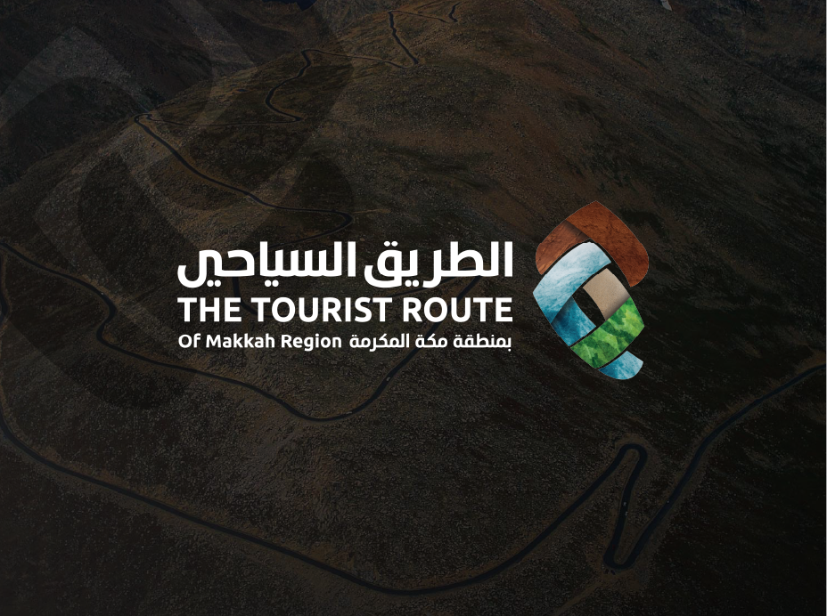
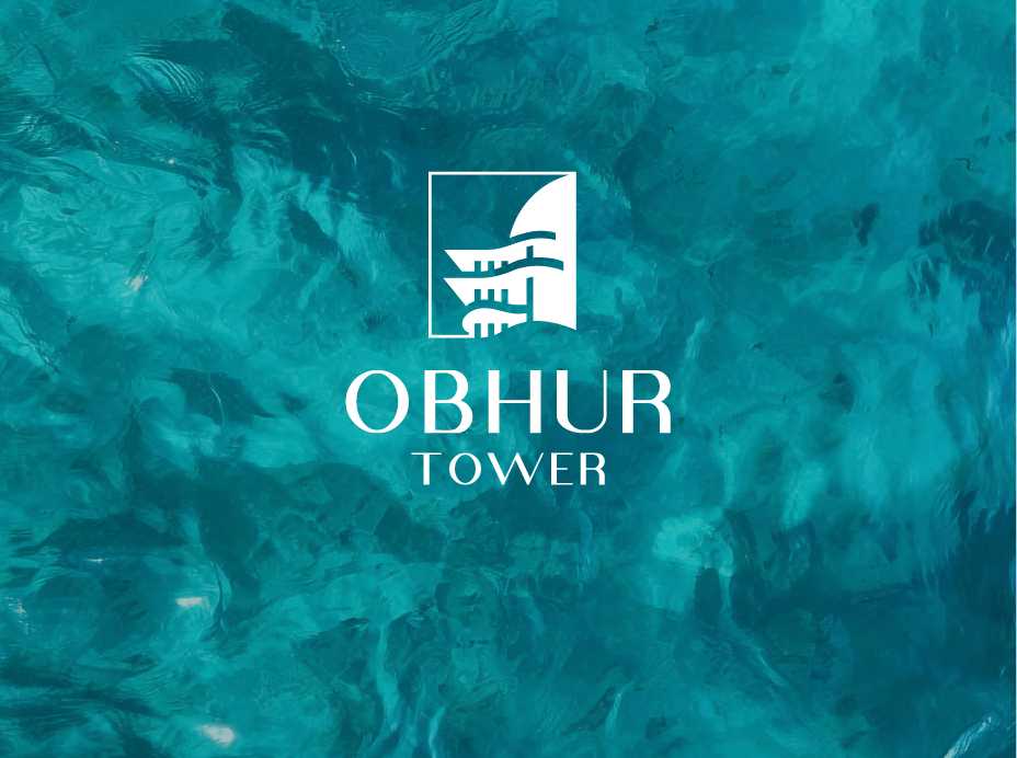
One system, every city.
Signage in Jeddah, an Arabic invoice in Riyadh, an app screen anywhere — the same rules produce all three, which is the only reason they look related.
- Jeddahجدة
- Riyadhالرياض
- Makkahمكة المكرمة
- Madinahالمدينة المنورة
- Dammamالدمام
- Khobarالخبر
The questions we get asked.
How do you handle Arabic and English typography in one identity?
We choose the pair together, never the Latin face first and an Arabic one to match afterwards. Three things have to hold: a comparable weight range in both scripts, so a bold Arabic headline exists at all; an agreed optical size relationship, because Arabic and Latin at the same point size do not read at the same size; and a body weight that stays legible in Arabic at small sizes, which rules out a lot of display faces. We also check the licence covers web and app embedding — otherwise the Arabic silently falls back to a system font on every device — and we proof real Arabic copy, including numerals and mixed-script lines, before sign-off.
Rebrand or refresh — how do we decide?
Ask what is actually wrong. If the business has changed — a new audience, a merger, a move upmarket, a name that no longer describes what you sell — the identity is answering a question you stopped asking, and a rebrand is honest. If the business is fine and the material simply looks dated, inconsistent or impossible to apply, that is a refresh: keep the recognisable assets, rebuild the system around them. A refresh is the far more common answer, and it keeps the recognition you have already paid for. We will tell you which one we think you need before quoting either.
What is included in a brand identity project, and what is extra?
Included: the core system (colour, bilingual typography, grid, imagery approach, iconography), master artwork in every format, guidelines in Arabic and English, a UI kit, and an agreed first wave of applications. Priced separately because they are open-ended: photography and illustration commissions, packaging structure and print production, signage manufacture, motion and video, and the website or app build itself. We fix the application list in the proposal so "one more template" is a conversation, not a surprise on the final invoice.
After handover, who applies the identity — you or our team?
Whichever you prefer, and the deliverables are built so it can be your team. That is the point of editable templates, a UI kit and guidelines written for someone who has never met us. In practice most clients run day-to-day work in-house and bring us in for the pieces where a mistake is expensive — signage, packaging, an exhibition, a campaign launch. We also offer a periodic review: we look at what has actually been produced over a few months and flag where the system has started to drift.
Will the identity still work on a phone screen and on a building sign?
That range is designed for, not hoped for. The system carries defined behaviour at each end: minimum sizes and a simplified mark for small applications, colour values specified separately for screen, print and vinyl because they do not match across media, and contrast pairings checked against accessibility thresholds rather than eyeballed. For signage we also account for viewing distance and night legibility, and for interfaces we account for the Arabic line height that the guidelines set. If a direction cannot survive both ends, it does not reach the shortlist.
- Jeddah
- Riyadh
- Makkah
- Madinah
- Dammam
- Khobar
Let’s build something that holds.
Send us what you have — a logo, a deck, a website, or nothing at all — and we will come back with a scope for the system around it.
- Free, no-obligation proposal
- Reply within one business day
- A bilingual Arabic & English team
- 9+ years serving brands across Saudi Arabia
Request a free proposal
Tell us about your brand — we reply within one business day.