Logo design in Saudi Arabia
One mark. Two scripts. Every size you will ever need it at.
A logo has one job: to be recognised instantly, at any size, in Arabic and in English, on a screen and on a wall. We design marks and bilingual lockups that hold up in all of those places — and hand over the source files, the variants and the ownership in writing.
It has to hold at sixteen pixels.
- 96pxSignage
- 64pxPackaging
- 40pxLetterhead
- 28pxApp icon
- 20pxEmbroidery
- 16pxFavicon
What makes a logo work in a bilingual market
In Saudi Arabia a logo is rarely one thing. Your company is written both ways, and both versions appear in public — the Arabic on the commercial registration, the signage and the invoice; the Latin on the domain, the app store and the export catalogue. Designing one and leaving the other to be produced later is how brands end up with an Arabic version that looks like a translation of a logo rather than a logo.
So the deliverable is a small family, not a single file: an Arabic version and a Latin version drawn to the same weight and proportion, horizontal and stacked arrangements for wide and narrow spaces, a compact symbol for an app icon or a stamp, and one-colour and reversed versions for print, engraving and embroidery. Each exists because a real placement demands it.
Arabic marks carry their own craft. A logotype drawn from a calligraphic tradition — Kufic, Thuluth, Diwani — reads very differently from one built on a contemporary Arabic typeface, and the choice says something about the company before anyone reads it. Whichever route we take, the letterforms are drawn and corrected as artwork, not typed once and stretched, because stretched Arabic is the fastest way to look unserious to an Arabic reader.
A logo on its own is not an identity. It is the anchor of one — the colour range, the typography, the layout rules and the guidelines are what let the mark be applied consistently by people who were not in the room. If you need the whole system, that is the brand identity page; if you need the mark now and the system later, we design the mark so the system can be built around it without redrawing it.
Not one file. A small family.
Every one of these exists because a real placement demands it — a sign, an invoice, a uniform, an app store listing.
- LtsThinkPrimary lockup
- خلينا نفكرArabic logotype
- LtsThinkLatin logotype
- LtsThinkStacked
- Compact symbol
- LtsThinkOne colour
- LtsThinkReversed
- LtsThinkOutline · engraving
What the engagement covers.
Custom mark & logotype
Drawn from scratch for your name and your sector — symbol, wordmark or a combination — and corrected as artwork rather than assembled from a typeface. We keep the number of concepts small and the thinking behind each one explicit.
Arabic & English lockups
Both scripts drawn to match in weight, height and character — not one traced from the other. Horizontal and stacked arrangements for each, plus the bilingual lockup where both appear together, with the spacing fixed rather than left to whoever is placing it.
Full variant set
Primary, secondary and compact symbol; one-colour, reversed and outline; app icon and favicon crops; minimum sizes and clear space defined for each. Every variant exists for a placement you will actually meet.
Reproduction testing
We test the mark where it has to survive: 16 pixels, a fax-quality photocopy, embroidery on a uniform, laser engraving, a vinyl cut, and a night-lit sign. Detail that only works on a presentation slide gets removed before you ever see it.
Source files & usage sheet
Editable vector masters plus every export you need for print, web, office documents and app stores — organised and named. With a short usage sheet: clear space, minimum size, approved colourways and the misuses to refuse.
Trademark-readiness check
Before we finalise, we search the Saudi Authority for Intellectual Property register and the obvious international sources for close marks in your class, and flag anything that looks like a conflict. We are designers, not trademark attorneys — the filing and the legal opinion stay with your lawyer.
Concepts — three ideas, not three colourways of one
Rounds of revisions on the route you choose
Stock symbols, and no logotype typed and stretched
Ownership assigned to your company in writing
Brief to handover.
- 01 · Blank artboard
Brief
A short session on what the company does, who it is for, which competitors it will sit beside, and where the mark has to appear. If a brand strategy exists we design to it; if not, we agree the three or four decisions we are designing against.
- 02 · Three routes
Concepts
Three distinct routes — distinct in idea, not three colourways of one drawing — each presented in Arabic and Latin and shown in place: a sign, a document, an app icon. We say which one we would choose and why.
- 03 · Curves corrected
Refinement
One route is chosen and taken to finish: curves and spacing corrected, the Arabic and Latin brought into true alignment, the variant set built, and the whole family reproduction-tested. Two rounds of revisions are included.
- 04 · Final lockup
Handover
Source files, every export format, the usage sheet, the trademark-readiness notes, and a written assignment of ownership to your company. If an identity system follows, this is the anchor it is built on.
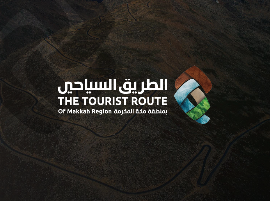
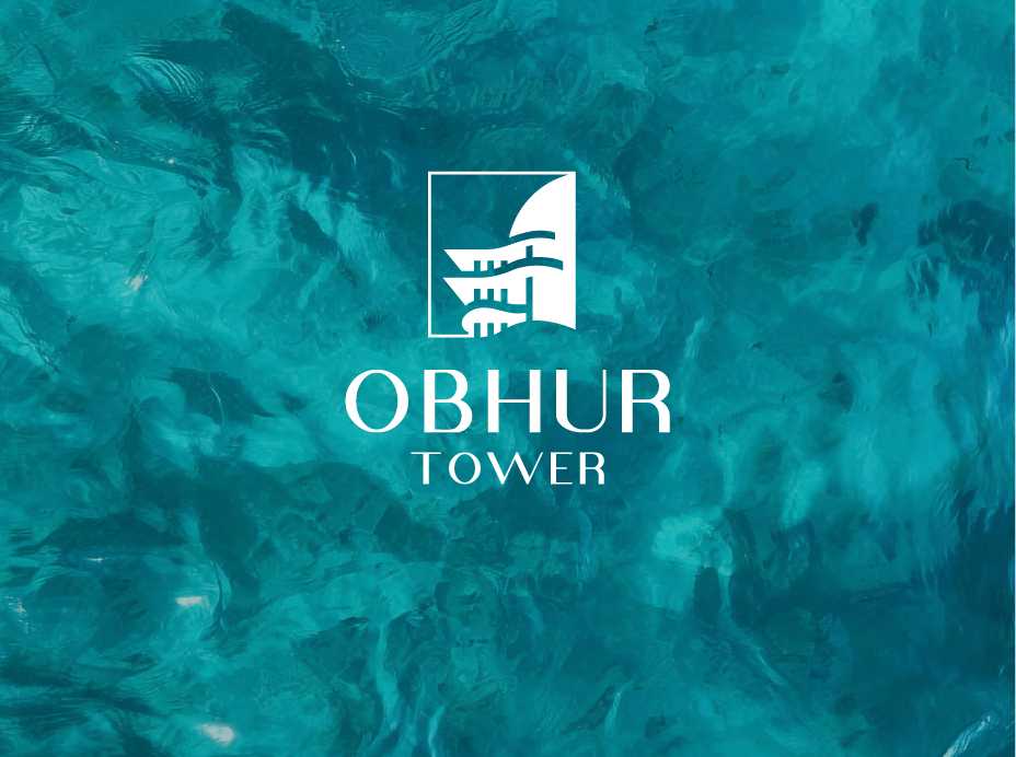
One mark, every city.
A shopfront in Jeddah, a commercial registration in Riyadh, an app icon anywhere — the same mark, drawn once, reproducing correctly in all three.
- Jeddahجدة
- Riyadhالرياض
- Makkahمكة المكرمة
- Madinahالمدينة المنورة
- Dammamالدمام
- Khobarالخبر
The questions we get asked.
How many concepts do we see, and how many revisions are included?
Three concepts, each a genuinely different idea rather than the same drawing in three colours, and two rounds of revisions on the route you choose. We keep the number low on purpose: a wall of twenty options is not generosity, it is a designer with no point of view asking the client to do the choosing. If none of the three is right, the brief was wrong — we go back to the brief at no extra cost rather than sending more variations at the same problem.
Do we get an Arabic version and an English version of the logo?
Yes — both are part of the standard deliverable, drawn together rather than one adapted from the other after the fact. You receive the Arabic version, the Latin version, horizontal and stacked arrangements of each, the bilingual lockup where both sit together with the spacing fixed, and the compact symbol. Drawing them together matters: an Arabic logotype traced from Latin proportions reads as heavy or cramped to an Arabic reader even when a non-Arabic reader sees nothing wrong.
What files do we receive, and do we own the logo?
You own it. On final payment we assign the rights to your company in writing, and you receive the editable vector masters — not only flattened exports — so any designer, printer or developer you work with later can use them without coming back to us. Alongside those: PDF and EPS for print, SVG and PNG at several sizes for web, an ICO/favicon set, app-icon crops, and versions that behave inside Word and PowerPoint. Everything organised and named so the right file is obvious.
Can you design a logo we can register as a trademark in Saudi Arabia?
We design with registration in mind and we check for it, but we cannot promise an outcome the registrar decides. Practically: we avoid generic sector symbols and descriptive wordmarks, which are the usual grounds for refusal; we search the Saudi Authority for Intellectual Property register and the obvious international sources for close marks in your class before finalising; and we supply the artwork in the formats a filing needs, including a one-colour version. The application itself, the class strategy and any legal opinion belong with a trademark attorney — we will work alongside yours.
Is a logo enough, or do we need the whole identity?
A logo is enough to open a bank account and put a sign up. It is not enough to make a proposal, a social post and a branch look like the same company — that consistency comes from the colour range, the bilingual type pairing, the layout rules and the guidelines that sit around the mark. A reasonable order is: mark first if you need to launch, system next before you start producing volume, because reprinting is what makes the second step expensive. We design the mark so the system can be added later without redrawing it.
- Jeddah
- Riyadh
- Makkah
- Madinah
- Dammam
- Khobar
Tell us the name. We will draw it.
Send us the company name in Arabic and in English, the sector, and where the mark has to appear — we will come back with a scope and a timeline.
- Free, no-obligation proposal
- Reply within one business day
- A bilingual Arabic & English team
- 9+ years serving brands across Saudi Arabia
Request a free proposal
Tell us about your brand — we reply within one business day.