01Clorox
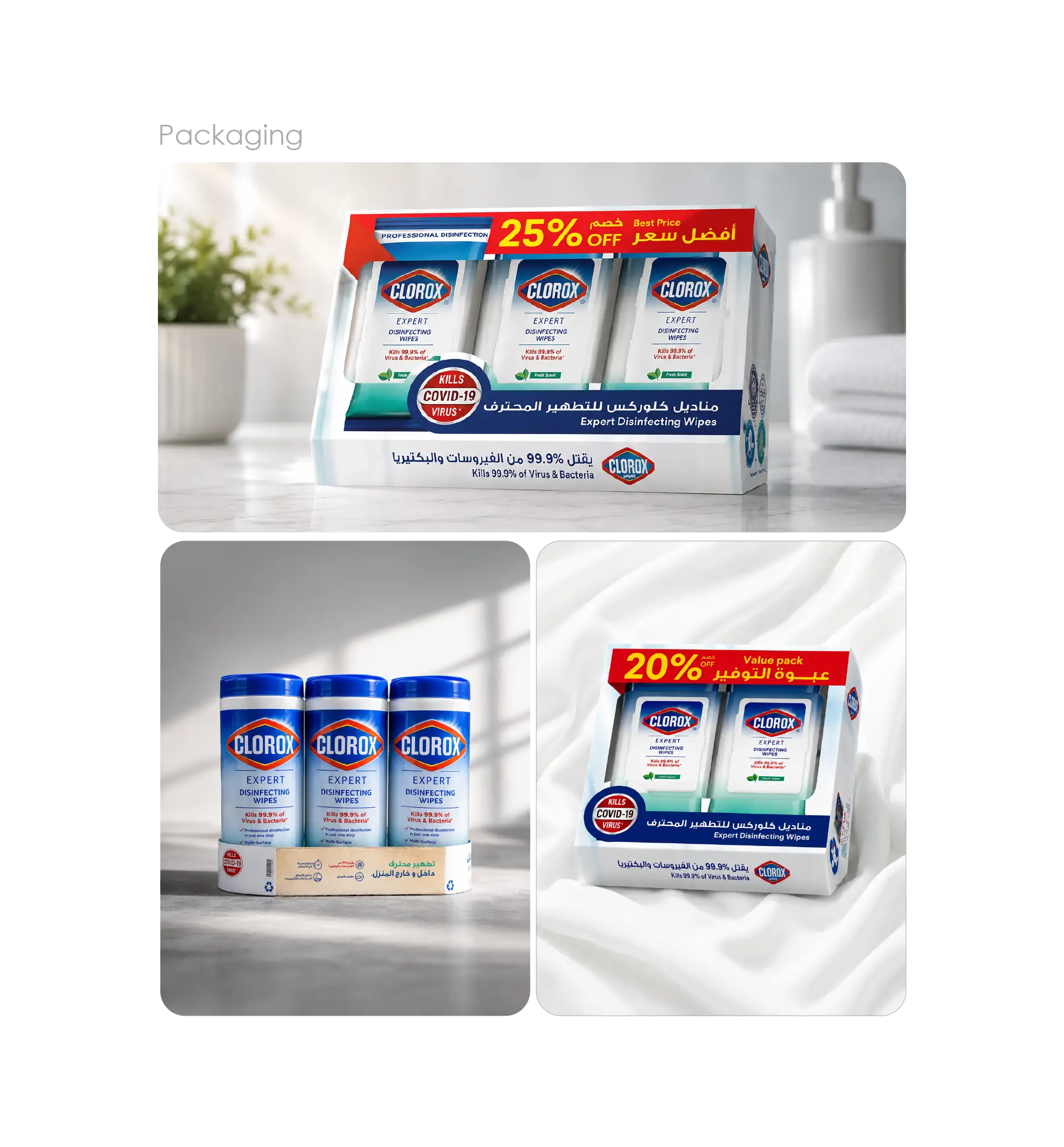
Clorox is a globally trusted name in cleaning and disinfection, with a product range that consumers reach for daily across homes and workplaces. For its line of sanitizing wipe canisters, the brand needed packaging artwork that carried that trust onto the shelf with clarity and confidence.
02The brief
Clorox came to LtsThink for packaging label design in Saudi Arabia covering its sanitizing wipe canisters. The core challenge was a single, coherent label system that scaled cleanly across the full range of canister sizes, keeping the brand instantly recognizable whether the product was a compact pack or a large household format.
03What we delivered
We developed the full label artwork for the canister range, treating each size as part of one unified family rather than a set of one-offs.
- Label design for Clorox sanitizing wipe canisters
- A scalable layout system adapted across multiple canister sizes
- Production-ready packaging artwork prepared for print
04The craft
Strong packaging design lives in the details — proportion, hierarchy, and how a label reads at arm's length on a crowded shelf. We kept Clorox's equity front and center, balanced product information with brand presence, and built each layout so the system holds together across every size in the lineup.