
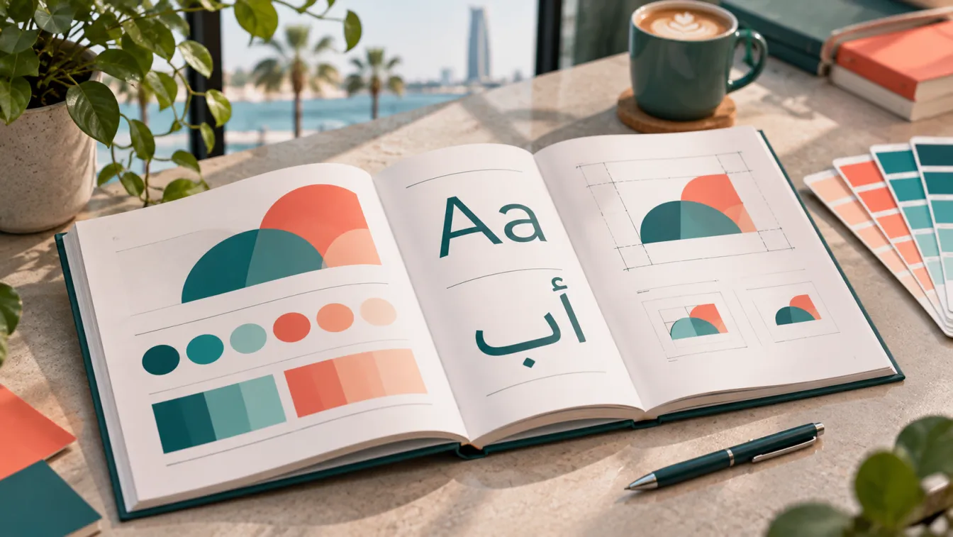
A brand guidelines manual is the document that explains how a brand's visual identity should be used consistently across every customer touchpoint. It gives employees, designers, marketing teams and external suppliers clear instructions for applying the logo, colours, typography, imagery and layouts without changing the identity's intended appearance.
For Saudi businesses operating in Arabic and English, a useful manual must go beyond displaying a logo and listing colour codes. It should explain how both languages work within the same visual system and how the identity translates into websites, packaging, signage, social media and everyday business materials. This is an essential part of professional brand identity design.
What is a brand guidelines manual?
A brand guidelines manual, sometimes called a brand book or visual identity guide, documents the rules that govern how a brand looks and how its identity is applied. It turns the design decisions made during a branding project into practical standards that other people can follow.
Without documented guidelines, different designers may use different logo proportions, colours, fonts and layouts. Marketing teams may introduce visual elements that do not belong to the identity, while suppliers may reproduce artwork incorrectly.
Consider a hypothetical Saudi retail company operating a website, physical stores and social media accounts. Its logo might look correct on the website but appear stretched on storefront signage, use different colours on printed materials and become difficult to read in social media graphics.
The problem is not necessarily the logo itself. The business needs clear rules explaining how the complete identity should be applied.
A brand guidelines manual creates that shared reference. It helps maintain consistency while allowing the brand to adapt to different formats, platforms and communication requirements.
Why does your business need brand guidelines?
A visual identity is only useful when people can apply it correctly. As a company grows, more employees, agencies, printers, developers and suppliers become involved in producing materials that represent the business.
A documented identity system helps solve several practical challenges:
- Visual consistency: Different teams use the same approved colours, typography, logo variations and design principles.
- Clear ownership: Employees know which assets are approved and where to find them.
- Better production: Designers and suppliers receive specifications instead of making assumptions about artwork.
- Bilingual coordination: Arabic and English applications follow a coherent visual direction.
- Easier expansion: New branches, campaigns, products and communication channels can use the existing identity system.
- Brand protection: Clear usage rules reduce unauthorised alterations and inconsistent applications.
For a business working with a branding agency in Riyadh, the guidelines should be treated as a practical handover document, not simply a presentation delivered at the end of the design process.
What should a brand guidelines manual include?
The exact contents depend on the business, its identity and the channels it uses. A corporate B2B company may need detailed presentation and document standards, while a consumer brand may require more packaging, retail and social media examples.
However, most professional identity guides should cover the following elements.
1. Brand overview and identity foundations
Begin with a short introduction explaining the brand's positioning, personality and visual direction.
This section connects the design system to the strategy behind it. It should explain what the brand represents, who it serves and what visual principles guide its identity.
Include:
- Brand purpose and positioning summary.
- Brand personality and key characteristics.
- Visual direction and creative principles.
- Approved brand description where relevant.
- A brief explanation of how the identity should be perceived.
This information helps future designers understand why the identity looks the way it does rather than treating the manual as a collection of unrelated design instructions.
2. Logo system and usage rules
The logo section is one of the most frequently referenced parts of the guide. It should explain the approved logo versions and how each should be used.
Depending on the identity, include:
- Primary logo.
- Secondary or alternative logo.
- Symbol or icon, where applicable.
- Horizontal and stacked versions.
- Arabic and English logo configurations.
- Monochrome and reversed versions.
- Minimum display size.
- Clear space around the logo.
- Approved background treatments.
- Incorrect logo applications.
Show practical examples of what not to do. These might include stretching the logo, changing its proportions, rotating it, adding unapproved effects or placing it over backgrounds that reduce readability.
The guide should also clarify which logo version is appropriate for different applications, including small digital spaces, printed documents and physical signage.
3. Colour palette and combinations
Document the approved colours and explain how they should work together.
A useful colour section includes:
- Primary brand colours.
- Secondary colours.
- Supporting and neutral colours.
- Colour combinations and recommended contrast.
- Digital colour specifications such as HEX and RGB.
- Print colour specifications such as CMYK, where available.
- Guidance for backgrounds, text and graphic elements.
Do not simply provide a list of colour codes. Explain the role of each colour and how combinations should be used.
For example, a hypothetical Saudi hospitality brand may use a deep primary colour for its main identity, a warm supporting colour for highlights and neutral backgrounds for readability. The guide should show how these combinations work across both digital and printed applications.
4. Typography and Arabic-English pairing
Typography is particularly important for Saudi brands because Arabic and Latin scripts have different structures, proportions and reading characteristics.
The manual should identify the approved Arabic and English typefaces and explain how they work together.
Include:
- Primary Arabic typeface.
- Primary Latin typeface.
- Supporting typefaces, where necessary.
- Arabic and English heading styles.
- Body text styles.
- Font weights and hierarchy.
- Recommended alignment and spacing.
- Digital and print usage guidance.
- Fallback fonts where required.
The objective is not to force Arabic and English typography into identical visual proportions. It is to create a balanced system in which both languages feel like parts of the same brand.
For bilingual companies, show examples of Arabic-only layouts, English-only layouts and mixed-language compositions. Pay attention to reading direction, line breaks, alignment and the relationship between headings and supporting text.
5. Photography, illustrations and graphic elements
Images and supporting graphics influence how customers perceive a brand. The manual should explain the visual characteristics of approved photography and illustration styles.
Cover:
- Photography subjects and composition.
- Lighting and colour treatment.
- Image cropping and placement.
- Illustration style.
- Icon design principles.
- Patterns, textures and decorative elements.
- Use of backgrounds and supporting shapes.
For a Saudi business, visual direction should also consider cultural relevance and the intended audience. A healthcare brand, an industrial supplier and a hospitality business will not necessarily need the same photography style.
Use examples that communicate the desired visual direction without suggesting that every image must be identical.
6. Layout, grids and composition
A strong identity needs repeatable layout principles. These help different designers produce materials that look related even when their content and dimensions change.
Document:
- Layout grids and alignment principles.
- Margins and spacing.
- Heading and body text hierarchy.
- Logo placement.
- Image-to-text relationships.
- Graphic element positioning.
- Rules for using whitespace.
- Responsive considerations for digital layouts.
This section is especially useful when multiple people create social media designs, presentations, brochures and website graphics.
7. Digital brand applications
The identity should work across the digital platforms where customers interact with the business.
A practical guide may include:
- Website header and footer applications.
- Landing page design principles.
- Social media profile images and covers.
- Post and story templates.
- Digital advertising layouts.
- Email signatures.
- Presentation templates.
- Digital document styling.
For websites, explain how typography, colour, imagery and brand elements should adapt to different screen sizes without losing consistency.
For social media, define the relationship between branded templates and more flexible campaign-specific creative work.
8. Physical applications and business materials
For companies with physical locations or products, the identity manual should include relevant real-world applications.
Depending on the business, these may include:
- Storefront and office signage.
- Reception and interior branding.
- Business cards and stationery.
- Company profiles and brochures.
- Uniforms and employee identification.
- Vehicle graphics.
- Packaging and product labels.
- Exhibition stands and promotional materials.
A restaurant or retail business may need detailed packaging and point-of-sale examples, while an industrial B2B company may prioritise vehicles, equipment markings, technical documents and exhibition materials.
Relevant product labels must also meet applicable regulatory requirements. For products subject to SFDA oversight, confirm the required information and presentation with the appropriate regulatory specialist. Brand design guidance does not replace regulatory or legal review.
Arabic-first identity: What Saudi businesses should check
An effective bilingual identity is not an English identity with Arabic text added afterwards. Both scripts should be considered during the design process.
A brand guidelines manual for the Saudi market should explain how Arabic and Latin elements work together across the complete identity.
Pay particular attention to:
- Arabic letterforms and legibility at small sizes.
- Correct reading direction and alignment.
- Consistent Arabic and English logo proportions.
- Appropriate font pairing.
- Line breaks and spacing in mixed-language layouts.
- Arabic text hierarchy in digital interfaces.
- Consistent spelling of brand and service names.
- Cultural suitability of imagery and symbols.
The manual should include real application examples rather than relying only on isolated font samples and logo artwork.
If the identity includes a bilingual logo, document the approved configurations and explain when to use each one. Do not assume that the Arabic and English versions must always appear together; the appropriate treatment depends on the context and available space.
How to organise and distribute the brand manual
A well-written document is not enough if employees cannot find or use the correct assets.
We recommend organising the brand files into a practical structure:
- Brand guidelines: The approved PDF or digital reference document.
- Logo assets: Organised versions for digital and print use.
- Typography: Approved font files and licensing information where applicable.
- Colour references: Documented colour values and usage specifications.
- Templates: Approved social media, presentation and document layouts.
- Application examples: Packaging, signage, stationery and website references.
- Asset ownership: A designated person or team responsible for maintaining approved files.
Use clear file names and version information. Make sure employees and suppliers can distinguish approved artwork from outdated or experimental designs.
Access to the correct files should be straightforward, while changes to core identity elements should follow an agreed approval process.
Common mistakes when creating a brand book
A manual can look impressive but still fail to help the business if it does not address everyday usage.
Avoid these common mistakes:
- Documenting only the logo: A complete identity includes typography, colour, imagery, layouts and applications.
- Using abstract rules without examples: Show how the rules work in real materials.
- Ignoring Arabic applications: Bilingual brands need specific Arabic typography and layout guidance.
- Making the guide unnecessarily complicated: Include relevant rules without documenting every possible design variation.
- Leaving out external suppliers: Printers, developers and production partners also need clear specifications.
- Failing to organise source files: A PDF alone does not provide the editable assets required for implementation.
- Never updating the document: Outdated logos, fonts and templates can create inconsistencies.
A practical guide should answer common production questions before they become problems.
When should you create or update your brand guidelines?
Create a manual when launching a new visual identity, introducing a new brand architecture or preparing a business for wider rollout across teams and locations.
An existing guide should be reviewed when the identity changes, new products or services are introduced, new communication channels become important or teams repeatedly apply the identity incorrectly.
However, not every business needs an extensive brand book immediately. A small company with a simple identity and limited applications may begin with a concise set of essential rules and approved assets.
You may not need to hire an agency yet if your positioning is still changing or the company has not agreed on its core identity. Resolve those decisions before documenting them as permanent standards.
The scope of the manual should reflect the actual complexity of the business. A useful guide is one people can understand, access and apply consistently.
Work with us: At LtsThink, we develop Arabic-first bilingual identity systems and practical brand documentation that help Saudi businesses apply their identity consistently across digital and physical touchpoints. Explore our brand identity design services to build an identity system supported by clear guidelines. You can also read our guide to brand voice guidelines to understand how verbal and visual identity work together.
FAQ
What is the difference between a brand book and a brand guidelines manual? The terms are often used interchangeably. Both document the brand's identity and explain how its visual elements should be applied. The exact scope depends on the business and the level of detail required.
Does every business need a complete brand guidelines manual? Not necessarily. Every business benefits from clear identity rules, but a smaller company may need only a concise guide covering its logo, colours, typography and essential applications. More complex organisations usually require broader documentation.
Should Arabic and English logos have separate guidelines? They should have clearly documented configurations within the same identity system. The guide should explain their proportions, alignment, spacing and appropriate applications in both languages.
Can we update our brand guidelines after launch? Yes. Guidelines should evolve when the business introduces new applications or makes approved identity changes. Updates should be controlled and documented so that teams do not continue using outdated assets.