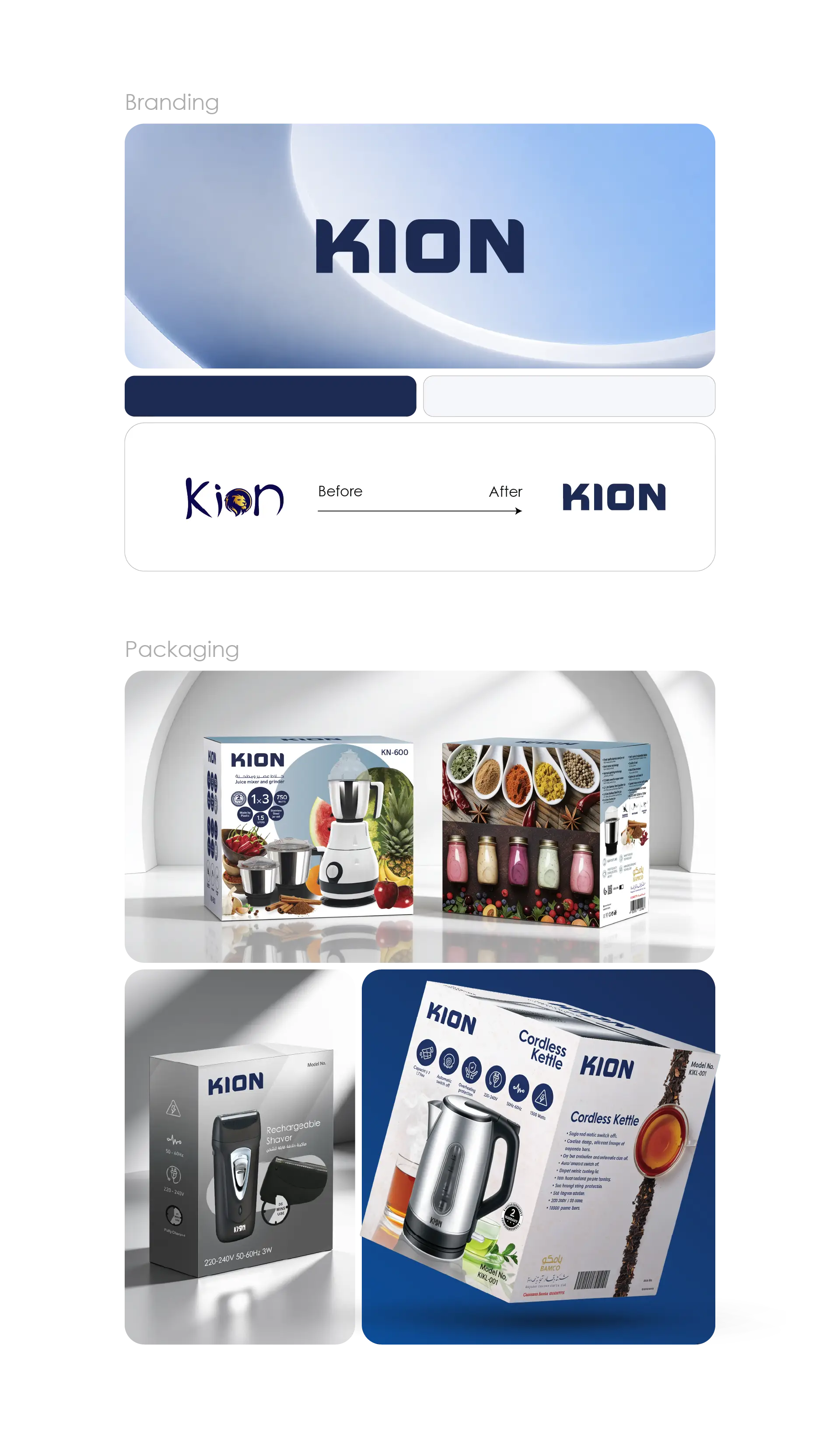
KION is a multi-product consumer brand that came to LtsThink to unify its look across a broad and varied product range. The brand needed a confident visual identity and a packaging system flexible enough to carry every line while staying recognizable on the shelf.
We started at the core, refining the KION logo into a clean, bold wordmark that anchors the whole identity. From there we built out packaging design in Saudi Arabia for the full catalogue — boxes and cartons tailored to each product type, with a consistent layout language that keeps the brand coherent from one SKU to the next.
We delivered:
- A refined KION logo and core brand identity
- Box and carton packaging design across all product lines
- A unified packaging layout and print-ready system
- Instruction-booklet layout and typesetting for the majority of products
The craft was in the system: one visual framework that scales across many different products, so packaging stays on-brand whether it is a single item or a full range. Each carton and instruction booklet was prepared to production-ready standards, giving KION a polished, dependable presence that customers can trust at first glance.